Typography is crucial in different areas of design such as web design, logo making, printing, graphic design, etc. But what is typography? It is the visual art of arranging typefaces, line-spacing (Leading), letter-spacing (Tracking), and spacing between each letter (Kerning).
Font affect the feelings of the audience that’s why understanding the psychology of typography will help you communicate and connect with your audience and increase conversion. Choose the font that suits the personality of your business to properly convey your message to your target market.
Every font has its own style and characteristics and it induces different emotions. So, how do you really pick the best fonts? Here is the meaning behind every typeface.
Typefaces
Serif
This typeface has a small line at the end of a stroke in a letter. It is considered easier to read than the sans-serif fonts when it comes to print. Serif fonts imply that you are in good hands. It also shows a classic appearance indicating that you’re in business for a long time.
Characteristics: Traditional, Reliable, Stable, Respectable, and Honest
Fonts: Times New Roman, Bodini, Georgia, Garamond, and Baskerville.
Sample Logos: Subway, Honda, Sony, Tiffany & Co., Wikipedia
![]()

Sans-Serif
Sans means “without”, this typeface is the one that does not use a serif (the small character or line at the end of a stroke in a letter). It is best to read on a screen that’s why it best for body text on the web. However, it is not that readable when it comes to print so it’s being used as headings or in a short content. Sans-serif typeface gives the feeling of familiarity and a basic look.
Characteristics: Clean, Simple, Contemporary, Universal
Fonts: Helvetica, Verdana, Arial, Century Gothic, and Calibri
Sample Logos: Spotify, eBay, Microsoft, Adidas, Youtube

Script
This type of font looks like a calligraphy or as if it was really written by hand. With its fancy style, it is best to use for logo and title only and not advisable for body text. Never use a script font in all caps, it will be difficult to read. The curves and creativity of Script show emotions and femininity.
Characteristics: Feminine, Fancy, Grace, Creative
Fonts: Lobster, Zapfino, Pacifico, Lucida and Brush Script
Sample Logos: Ford, Herschel, Coca-Cola, Johnson-Johnson, Instagram

Modern
It is named Modern, but it is new. Modern typeface started in the eighteenth century. You can identify this font with its flat, thin and thick style, and horizontal serifs at the end of a stroke in a letter which shows a strong and elegant look.
Characteristics: Trendy, Strong, Stylish
Fonts: Eurostyle, Majoram, Matchbook, Didot Italic, Century Gothic
Sample Logos: Gap, Vogue, Calvin Klein, Kate Spade

Decorative
A decorative typeface is known for its unique design. With its eye-catching style, it was best used for advertisement and not recommended for body text. The versatility of this font allows the user to customize or adjust the letters or font. Overusing this font decreases its impact or style.
Characteristics: Unique, Casual, Fun, Friendly, Expressive
Fonts: Ravie, Snap ITC, Ad lib, Andreas, Arenq, Kanji, Retrospective
Sample Logos: Disney, Harry Potter, Metallica


Typeface is not the only factor affecting the feelings of your audience. Take note that the Leading, Tracking, and Kerning also takes a big part in manipulating typography. Every font usually has default settings for these three, but most of the designers change it for a better look or readability. There are some cases that changing these three aren’t necessary.
Leading
Leading is the vertical space between baselines of type. The term leading originated from the lead strips that were used between metal type in printing pressed. Leading plays an important role to make the font or letter attractive. Smaller or limited leading make the text looks compressed and harder to read, so it’s better to have a wider (but not too wide) allow your text to breathe to make it easier to read. Each font has its own style, lead settings will depend on what font you are using.
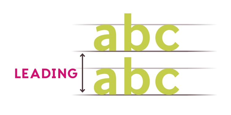
Image Credit: InDesign Skills
Tracking
Tracking is the uniform space between all letters or the whole word. Changing it affects the whole group of letters. Unlike leading, wider space in tracking is harder to read than narrow tracking. Adjusting tracking is made to eliminate the widow and orphan in the paragraph. Widows are when the final line of a paragraph begins a new column or page while orphans are when paragraphs end in single words, part of words or a short phrase that seems out of place.
![]()
Image Credit: Creative Market
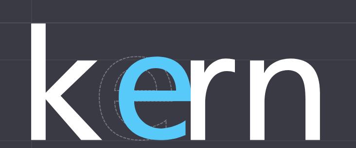
Kerning
Kerning is the space between each letter. A proportional spacing between each letter is crucial to make your text pleasant to the eyes. Readers should not notice the changes in kerning so keep in mind to make it look natural when adjusting. The spacing of each letter doesn’t have to be equal, it should be visually adjusted and not mathematically. There are some typefaces that are hard to kern such as slanted letters and letter with cross strokes, use your own judgment in kerning these letters.
Final Thoughts:
Getting to know different fonts can be challenging. Take a look at the different logo or font and see what you think and feel about the font for you to have an idea on what font you like to use. You could also get or copy the font that you desire since there are a lot of free fonts available online.
Sounds like a challenge for you? Get in touch with our professional team here at Infinit3Solutions who is an expert when it comes to branding. Contact us today and we’ll help you choose the right font for your brand and create the branding for your business.