Pablo Picasso once said, “Colors, like features, follow the changes of the emotions”. The impact of colors, which were famously quoted as “smiles of nature” still remains an enigma, even with multiple research backing it up throughout the years. Armed with Psychology researches, marketers have developed through years of study and probably trial and error, on what colors seem to work on products and services and how a company’s vision and mission can be explained, without words but with a few brush strokes.
Do colors really have an effect on us?
The answer is one big yes! Colors definitely make the world burst into life and has the capability to invoke emotions. We associate memories and emotions with colors. Psychologists have concluded that our connection with colors initiated after associating it with objects and emotions. It is a common knowledge that green is associated with nature, red with anger, blue with water, and the list goes on. It has been like this since the beginning of times and known all over the world. In fact, color is probably the only medium that transcends through the language barrier.
How do we select a color for our business?
After establishing the nature of the business that you want to set up and creating a logo, selecting your colors should be next on your list. And this is a big deal. Unfortunately, when it comes to colors, we cannot just rely on what looks good, we kind of need to follow some certain rules, otherwise, our brand will be lost in translation. Fun fact, did you know that almost 90% of customers based their purchase decision on colors? Example, how would you perceive a company selling cars if they use pink? You will automatically think that their products are aimed at women customers.
So how would you determine a color to compliment nicely to your brand? Try to check this simple brand personality spectrum:
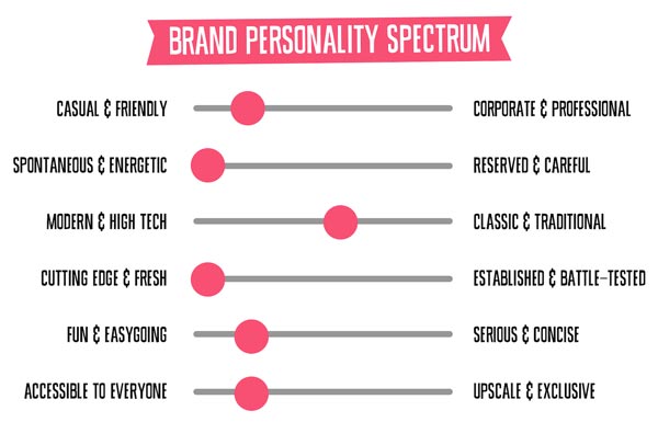
Image credit: splashmagazine.com
Applying colors to your Branding:
Now that we have established that colors do invoke emotions, let’s apply this concept to your business. What matters more for customers is what they feel about your brand, and not what they think. Have you tried to check an online store before, and just had a weird feeling about purchasing something so you ended up not buying anything? This is not the emotion that we would like to evoke to your future customers.
Using the same colors in your branding can boost brand awareness. Like, Facebook and Twitter is blue, McDonald’s is red and yellow, Starbucks is green, and so forth.
Your chosen color should be visible in:
- Logo
- Website
- Social Media Accounts
- Marketing materials (brochures, flyers, business cards, etc.)
Once you have selected a color for your brand, make sure that it is visible in all aspects of your marketing and business identity. Do not play or add other colors. A sense of uniformity creates a more professional tone in business. It also makes you easily remembered. If you think your customers will not notice, think again.
List of the popular colors used:
Red
Red draws attention and has a sense of urgency. It is best to be used to accent other colors since it is too intense if used on its own.
Targets:
Physical/body
Meaning:
Energy, war, anger, strength, power, determination, passion, desire, and love, physical courage, warmth, basic survival, masculinity, excitement, romantic, hunger.
Blue
As a trusting and secure color, Blue is a favorite among corporate designs. It is also loyal and dependable, and a great color if you want to secure trust.
Targets:
Intellectual/mind
Meaning:
Intelligence, communication, trust, efficiency, serenity, duty, logic, coolness, reflection, calm, loyalty, peaceful, harmonious.
Green
Very easy on the eyes, Green is usually connected to nature. It is also appealing to budget shoppers.
Targets:
Balance/Nature
Meaning:
Growth, harmony, freshness, fertility, financial, stability, endurance, balance, refreshment, universal love, rest, restoration, reassurance, environmental awareness, eco-friendly, organic, earthy.
Yellow
This fun, positive, and youthful color projects feelings of happiness and creativity. Yellow is also popular with kids.
Targets:
Positive emotions
Meaning:
Joy, happiness, intellect, energy, honor, loyalty, optimism, confidence, self-esteem, extraversion, emotional strength, friendliness, creativity.
Purple
It invokes a feeling of luxury, warmth, and calm. A darker shade calls for sophistication and sharpness.
Targets:
Spiritual. Luxury.
Meaning:
Royalty, power, nobility, luxury, ambition, wealth, extravagance, wisdom, dignity, independence, creativity, mystery, magic, spiritual awareness, containment, vision, luxury, authenticity, truth, quality.
Orange
Similar to Yellow, Orange is also a fun and playful color. Orange is a great color to use for call-to-action buttons.
Targets:
Positivity
Meaning:
Joy, sunshine, tropics, enthusiasm, fascination, happiness, creativity, determination, attraction, success, encouragement, physical comfort, food, warmth, security, sensuality, passion, abundance, fun.
Pink
Popular among women since it is a fun, exciting and feminine color. If your products are aimed at women, then, this color is for you.
Targets:
Feminity, charm
Meaning:
Physical tranquillity, nurture, warmth, femininity, love, sexuality, survival of the species, soft, sweet, health, beauty, romantic.
Grey
Depending on its shade, Gray can also be seen as conservative, elegant and formal and a bit less bold compared to black. Check the shade though, for it can also be perceived as depressing or boring.
Targets:
Elegance
Meaning:
Psychological neutrality, techy, sleek, modern, futuristic.
Black
A powerful and luxurious color, which is why it is popular among luxury brands. If you want to make your customers feel that they are purchasing a premium product, then, choose this one.
Targets:
Luxury
Meaning:
Power, elegance, formality, mystery, fear, grief, sophistication, glamour, security, emotional safety, efficiency.
White
It is usually perceived to attract creative thoughts, fresh beginnings and a top choice for minimalism.
Targets:
Simplicity
Meaning:
Light, goodness, innocence, purity, virginity, safety, cleanliness, faith, hygiene, sterility, clarity, simplicity, sophistication, efficiency.
Once you have selected a color (or colors) in which you felt that will strongly connect with your brand, don’t forget to envision if it will look good in all your marketing materials, online and on print. There is no need to rush this process for your brand colors will serve as a badge or an identity to your business and it is not advisable to change it too often.
If you want a sound advice or leave it to the professionals, contact us today and we’ll be glad to help you get a head start in your business!