Being swamped with marketing materials practically everywhere we look, there must be a few times that a certain advertisement sticks into our heads, for good or bad reasons. It can be like “ooooh I like this design or photo”. Or, it can be “this is nice but there’s something wrong with it”, and we can’t seem to figure it out. It might be your inner OC that’s calling you out, and you could be right. A design does not follow rules strictly by the book, but thanks to years of study and analysis, design principles and psychology exist which aims to explain how we, humans, perceive certain compositions. Why is this important? Because a design does not only need to be “beautiful”, it needs to send a message to your audience, and if your message is not voiced out clear, then it will defeat the purpose.
Delving into various principles and psychology of design can be intimidating especially for non-designers. The explanations are relatively easy; the problem usually lies in the implementation or execution. Let’s start with the basics first and briefly touch the elements of design before we dig deeper.
Elements of Design
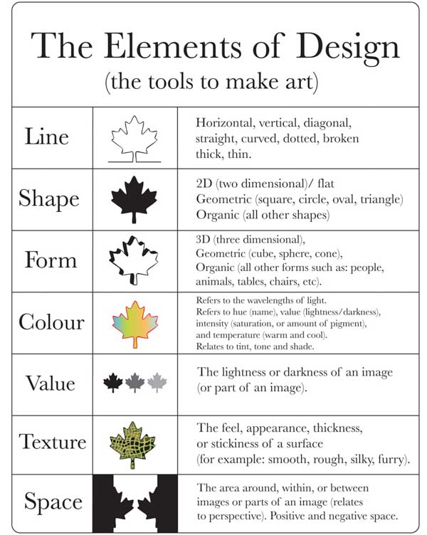
Image credit: splitcomplementary.blogpsot.com
These are your “weapons” or tools in creating a masterpiece. Say hello to Line, Shape, Form, Color, Value, Texture and Space.
Now, let’s go to the main point. After hours of research and years of experience, we have simplified the basic design principles and psychology to make it more understandable to novice designers. We also provided some examples on how it can be implemented flawlessly. Remember, you can apply all these not only in selecting a logo but to other marketing materials as well, may it be the tried and tested traditional or digital marketing. Fret not, for we have simplified these design principles, with some examples on how it can be implemented flawlessly.
We are drawn to beautiful aesthetics – Visceral Reaction
To put this simply, visceral reaction is how we respond to an object or stimuli. In design, of course, the goal is to create a positive or a strong reaction. That’s why travel agencies create the best photos or travel posters of different destination pages or different foundations showcase moving photos (remember the seahorse clutching a cotton bud?).
Keeping the “it has to be beautiful” objective in mind, let’s not get carried away by splashing our artboard with multiple colors and fonts. Just sit tight as we discuss on how we can keep our visual design beautiful without going overboard.
Keep it simple with Hick’s and KISS
It’s true that us humans prefer to have more options. However, once we have multiple options, we become overwhelmed and indecisive, thus, we spend more time in the decision making process. Hick’s law, which is coined by psychologist William Hick and Ray Hyman states that the more options presented, the time spent on making an actual decision will take longer. With this in mind, it makes sense that pop-ups on the website has huge JOIN US NOW or Subscribe NOW. In visual design, the more elements existed in the canvas, the more it becomes straining in the eyes. Take this as an example:

Image credit: printaholic.com
In this, there are just way too many elements overlapping the space. The black background doesn’t help much to make the words readable, and it takes a while to comprehend what type of business this card for.
So how do solve this? That’s where the KISS will come in handy. KISS – Keep It Simple, Stupid. By keeping this in mind, we can ask ourselves if a certain character, element or color is necessary for a design. If not, then, remove it.
Don’t forget Gestalt Theory
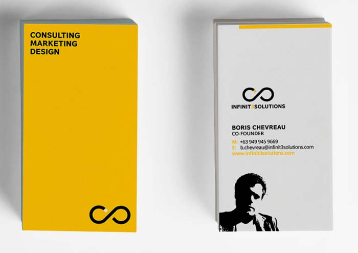
Back and front design of our latest business cards.
Developed by German Psychologists in the 20’s, this principle is still relevant in today’s design world. Gestalt Psychology’s core concept is how our minds see visual elements in groups or as a whole. This is based on some of these concepts, and do refer to our sample business card as an example.
Similarity
Shapes, colors, size, and textures that are placed together are perceived as a group.
Try it by: For starters, separate fonts and images to instantly create a clean and smooth artboard.
Continuity
It is the principle that our eyes move into a natural fluid motion from left to right.
Try it by: Use curved or straight lines in the design
Symmetry
This happens when lines are used to guide our sight to the focal point of the design (even in photos). Symmetry, of course, creates a harmonious flow, no matter what design medium you are using.
Try it by: Striving for balance, in terms of visual weight (having one focal point or focus in the canvas) and visual direction (how our eyes move to see the focal point).
Proximity
The distance between different elements makes us perceive similar or different objects in groups, the closer the objects are, the more we associate those in one group.
Try it by: Placing information in groups. Keeping the business card as an example, notice that the logo, contact information, and the artwork were separated into “chunks” or groups.
Closure
It’s basically our obsession to see close shapes. A design seems to be incomplete and our eyes basically fill in the gaps to see the design as a whole.
Try it by: Play with the white space. You do not necessarily need to fill in the white or “empty” space in your canvas.
Simplicity
We see objects in its simplest form, as a whole, rather than the small and different components that build it.
Try it by: Using vectors or graphics with clean lines or use objects in its simplest form whenever possible.
Design is one tricky art in which rules and principles are bent once in awhile in strive for perfection or even the perfect “imperfection”. However, before bending the rules, we need to be familiar with the main concepts to have a better understanding on how we should approach it. Again, a design is not only about “what looks nice”.
Now that we have laid down the foundation, stay tuned for our next post (nope, we are not yet done, and we still have a long way to go) about fonts, psychology of colors, and a whole lot more!
Do you want gorgeous marketing materials without spending too much time? Never miss leaving a strong impression by getting in touch with our design team today!
